
UMICH Votes
Instilling Confidence in 1st-Time Voters
Understanding how 1st-time voters perceive information presented by UMICH Votes and how we can make the voting process less overwhelming
person
role
UX Researcher
access_time_filled
timeline
4 Weeks (Sep. - Oct. 2023)
work
skills
Usability Testing, Affinity Mapping, Wireframing, Storytelling
group
team
5 UX Researchers, 1 Project Manager
brush
tools
Miro, Figma
overview
The UMICH Votes Coalition represents the collaborative efforts of multiple campus organizations to encourage students to engage in the democratic process by voting. They want their website to become the primary resource regarding registration and voting for students, but the website struggles with providing students the information they are looking for.
As a UX Researcher, I worked with our team to conduct usability tests to learn about students' current experiences with the website. We took these insights and presented recommendations to the UMICH Votes Coalition for how their website could better address the needs of students.
background
the current website
The current UMICH Votes website was hastily redesigned in time for the Fall 2022 Elections. Because of this, some features work well for students, and others not so much, but the UMICH Votes Coalition doesn't know the specifics. They want user-testing data to formalize their understanding so that they can relaunch their website in January 2024.

initial meeting with client
To learn more about the client, the UMICH Votes Coalition, and where the project currently stands, we spoke to representatives of UMICH Votes to make sure we all had a shared understanding of the project goals and expectations.
biggest takeaways about UMICH Votes
Target users are students who are first-time voters
Serves students by directing them to relevant registration and voting information depending on their circumstances
Strives to make information clear and welcoming to reduce students' anxiety about the voting process
Aims to be a united and trustworthy source for faculty and students on campus
thus, we asked:
How might we make the UMICH Votes website clear and not overwhelming for 1st-time voters?
user research
user testing
To learn more about users' expectations and experiences with the website, we developed a user-testing protocol and conducted user testing with 12 students. For user-testing, we implemented the think-out-loud approach to assess:
Exploratory Usability: user's familiarity with the website and its navigation
Informational Usability: website's ability to effectively communicate information about registration and voting
user insights
Users are unclear about the separation between registration and voting information on the website, struggling to find what they want

Users experience frustration with excessive scrolling and a challenging navigation experience

Users struggle with reading and exploring the website content

Users struggle with finding FAQs that will answer their questions

recommendations
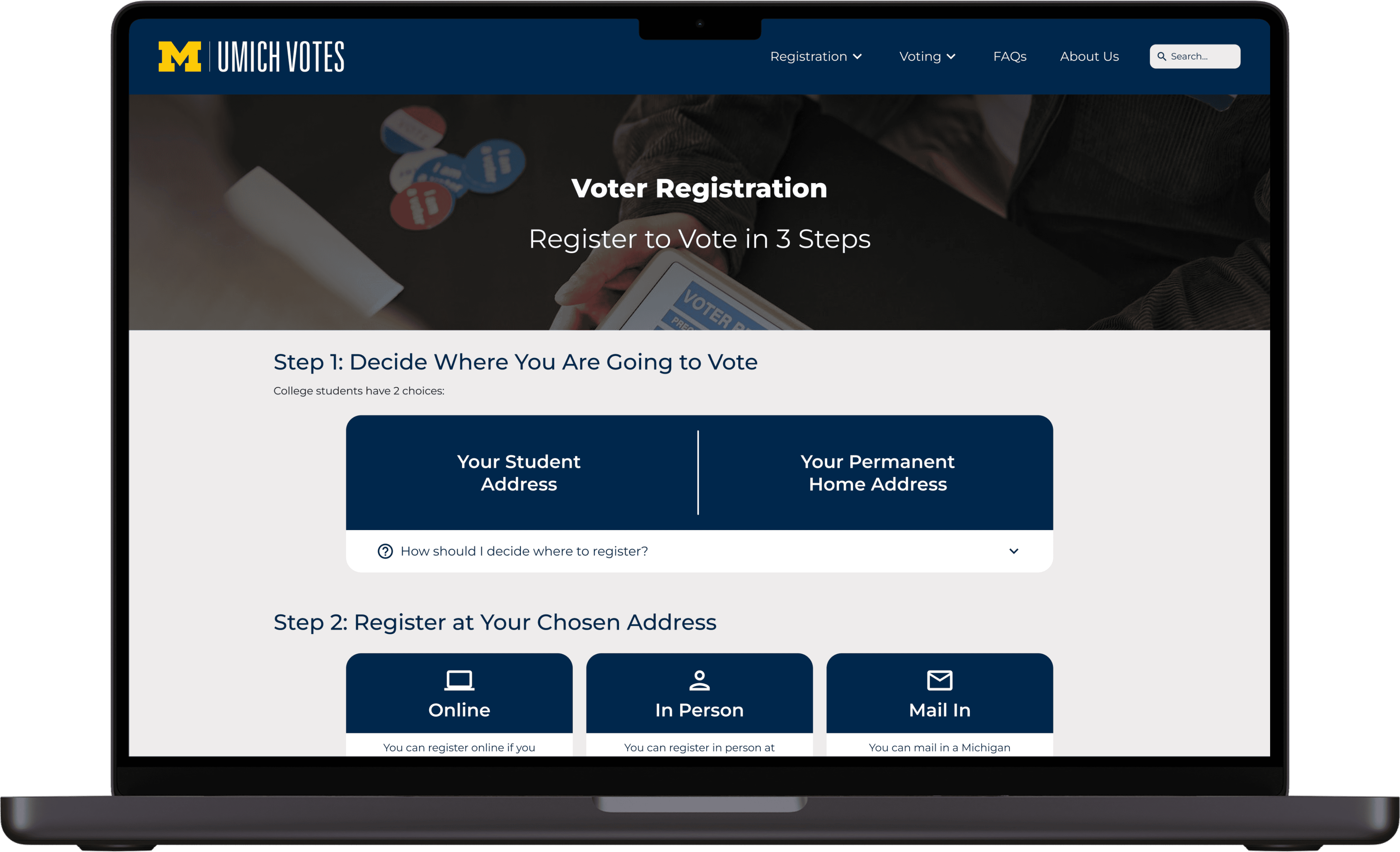
redesign of navigation bar
lightbulb_2 Separate "Registration" and "Voting" tabs
double_arrow Users effortlessly grasp the website's purpose and find information
lightbulb_2 Include "FAQ" tab
double_arrow Users can access FAQs no matter where they are on the website
lightbulb_2 Implement mega dropdown menu
double_arrow Users have clear visual of the contents of the website

improve user resources
lightbulb_2 Add search bar in FAQs
double_arrow Users can quickly look up information relevant to their question
lightbulb_2 Expand and categorize FAQs
double_arrow Users save time looking for specific information
lightbulb_2 Include glossary of common voting terms
double_arrow Users gain a better understanding of the information on the website

rearrange website layout and add graphics
lightbulb_2 Make headings bolded and more informative
double_arrow Users can more easily scan pages
lightbulb_2 Apply progressive disclosures
double_arrow Users with more background knowledge can avoid scanning lists/features they would rarely use
lightbulb_2 Incorporate graphics and images
double_arrow Users experience less fatigue compared to reading blocks of text
reflection
keep the client in the loop
Given the short time frame of this project, we didn't want to risk having to redo anything if it didn't align with the client's goals and expectations. This made it extremely important for us to stay in constant communication with the client. Eliciting feedback from our client at each step not only made sure we weren't straying too far from the shared vision, but also kept the client informed about the progress being made.
orient issues around the user experience
While we all had our own assumptions about what could be improved about the website, it was important for us to focus on the users and the struggles they were facing. This ensured that the recommendations we provided would address their problems, creating a more enjoyable user experience. While the recommendations we ultimately came up with included some of our initial ideas, there were also others that we only thought of after analyzing the user-testing data.
put yourself out there
I still find putting myself out there scary, but this project really showed me the importance of doing so. We were struggling with recruitment for user testing and only had a couple sign-ups, so on the day of testing, I decided to go out and actively recruit people nearby. While this may have introduced some bias into our data, we decided it was more important for us to get as many people as possible for testing.